We’ve all seen it. We glance across the shelves and suddenly a volume stands out among the other tomes. What drew us to it? Perhaps the title struck a cord in our hearts. Perhaps a picture on the book face grabbed our attention. Perhaps aesthetic elements drew us in. Probably… we fell prey to a combination of all of these.
Inversely we’ve seen the opposite as well. Beside that one book sit ten other books who did not make the cut for whatever reason. And it usually has little to do with the quality of the book contents. A book can have a wonderful story or message and be trapped in a cover that does not attract attention or the right audience.
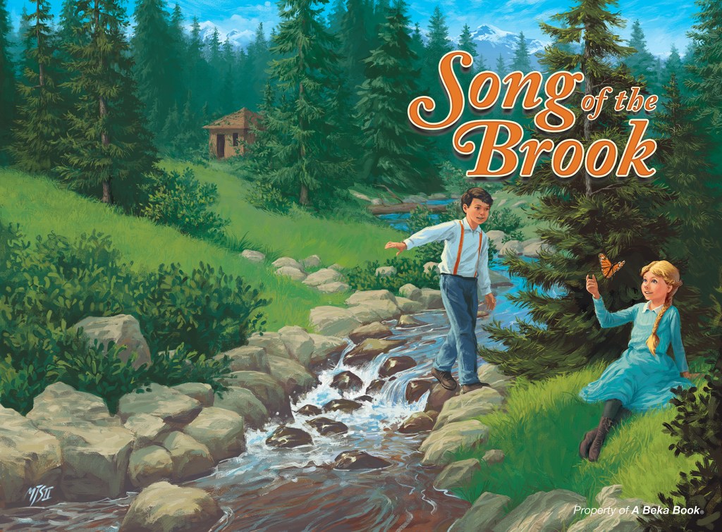
Find the book at www.abeka.com.
I love making covers! I guess my joy stems from my love of reading books or watching films or listening to music. But I also find as much pleasure in crafting meaningful visuals. I love making a book come alive. I enjoy translating the ideas in a movie into the still frame of the cover. I delight in using color and composition to hint at the emotion in a music album. Ideally, when someone looks at one of my covers, he intuitively understands what Is inside the cover.

Watch at www.christiancinema.com.
And that is my first principle of cover design: a book cover must represent the book contents. (And whenever I talk about books, the principles hold true to ANYTHING that we put a cover on. Even the cover image to YouTube videos ought to follow these principles.) A book holds meaning within it’s pages. Thus, its cover ought to reflect that meaning. This correlation should occur in several areas of a good cover design: the actual title words, the typography, the main image, and any abstract design or compositional elements. All of that ought to work together to express the books intended meaning.
To download a sample of the interior with a few more of my illustrations,
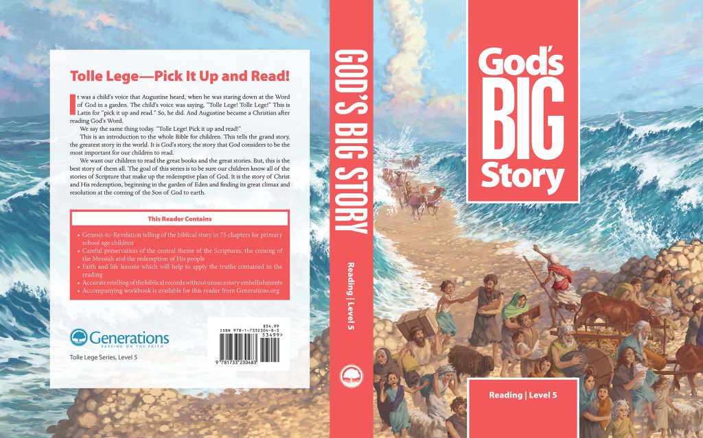
go to generations.org.
Second, the book has an audience. Someone reads the book, even if only the writer’s mom. Preferably, though, the writer’s mom hopes the book attracts many more readers. This target group of people expects something from the book and enjoys certain aesthetic experiences. The designer ought to dress the book’s meaning in ways that the target audience will understand, appreciate, rally around, and advocate.

The editor and I chose images the audience would immediately recognize.
Third, clarity must hallmark the design. Nothing ought to impede or distract the audience from understanding the content. The title must immediately grab attention and read clearly. The visual elements cannot compete with the title, bu ought rather to complement it. A good designer will establish a visual hierarchy, allowing the viewer to read title and perceive the content almost instantaneously.

See the American version at www.mediatalk101.org.
Lastly, the cover must evoke a powerful aesthetic emotion from those in the book’s target audience. Understanding is never enough. The design must arrest and transfix the audience. They should feel the content intuitively, upon sight. The cover should intrigue or attract its audience the moment they lay eyes on it.

Whether I design it or illustrate it or both, I use all these same principles.
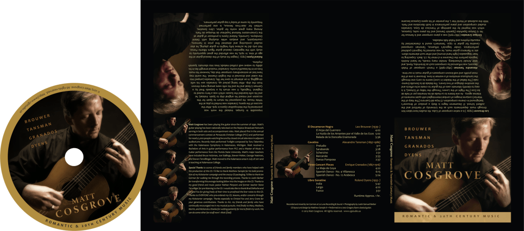
Listen to it at facebook.com.
To give an example for these principles at work, here is the process that I recently went through to make the cover to The Dorean Principle, which is in the midst of book launch as I write this.
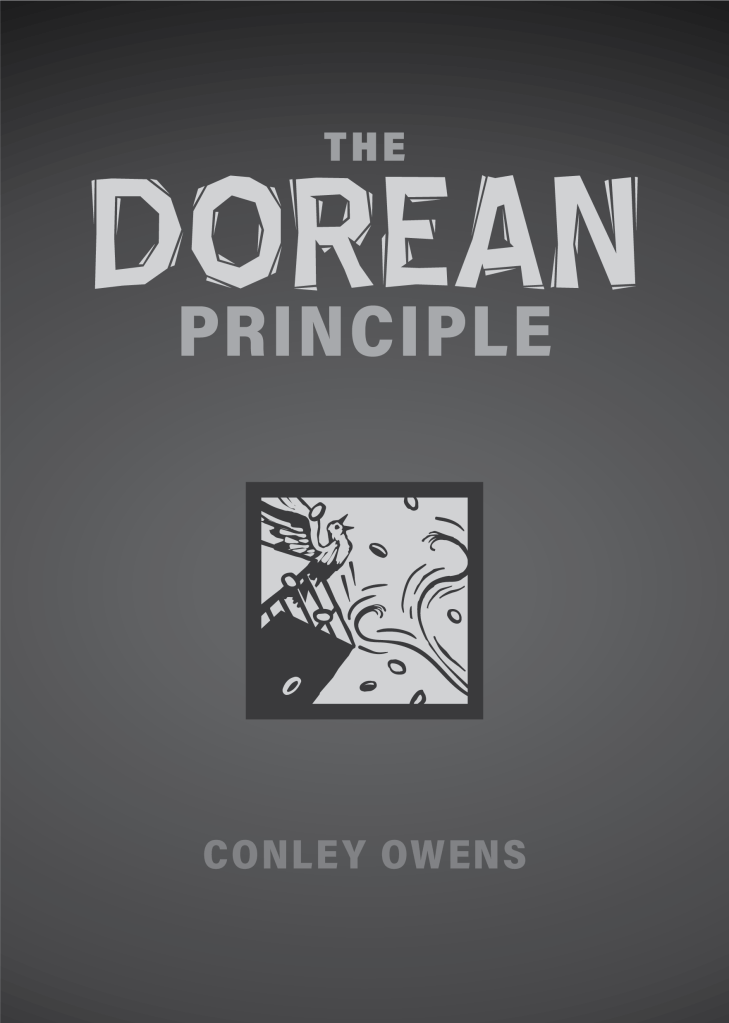
At the beginning, often I and my client will come at the project with different expectations for the project. This is normal. We can sit down and talk, but until I show him some sketches or basic designs, we can actually use the same words to mean completely different things. The sketches will give the client an understanding where I am coming from and how better to communicate the direction he wishes to go with the cover.
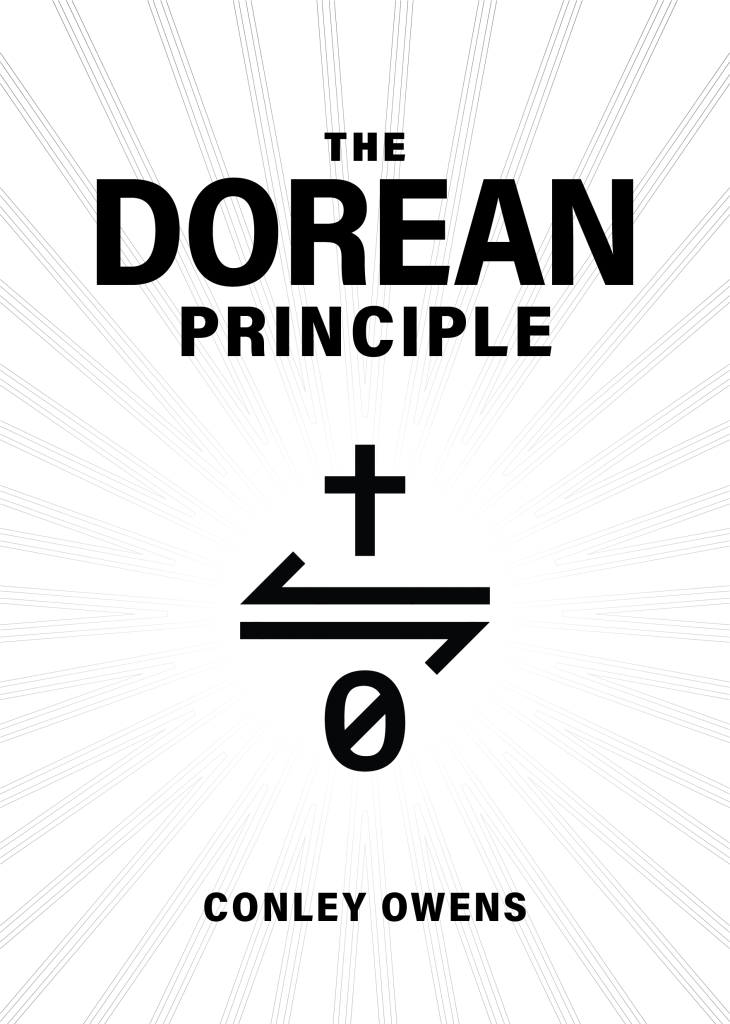
The first set of sketches were based solely on featuring a mathematical symbol that epitomized the doctrinal truth explained in the book. As we thought about what didn’t work for the sketches in the first cover, we realized that the title and the symbol were both a bit too mysterious. You need to read the book to know what they meant. We talked about a few different Bible stories that illustrated what Conley had written about, and settled on the cleansing of the temple.
After the second batch of sketches, we found another expectation that needed resolving. In this case, I thought that my client wanted something simple and streamlined. However, when he saw the results, he decided he wanted a fully illustrated cover.
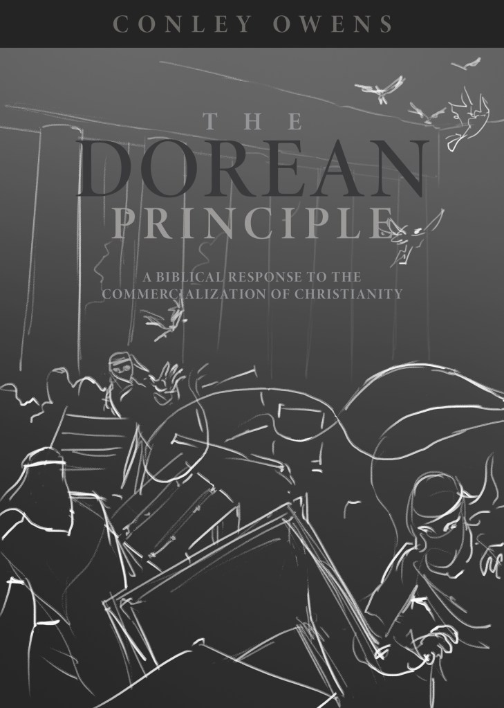
Going back to the sketchpad one more time, we tried a normal view of the temple cleansing, but ultimately decided that a view from above the scene resulted in a more intriguing image with possible metaphors.
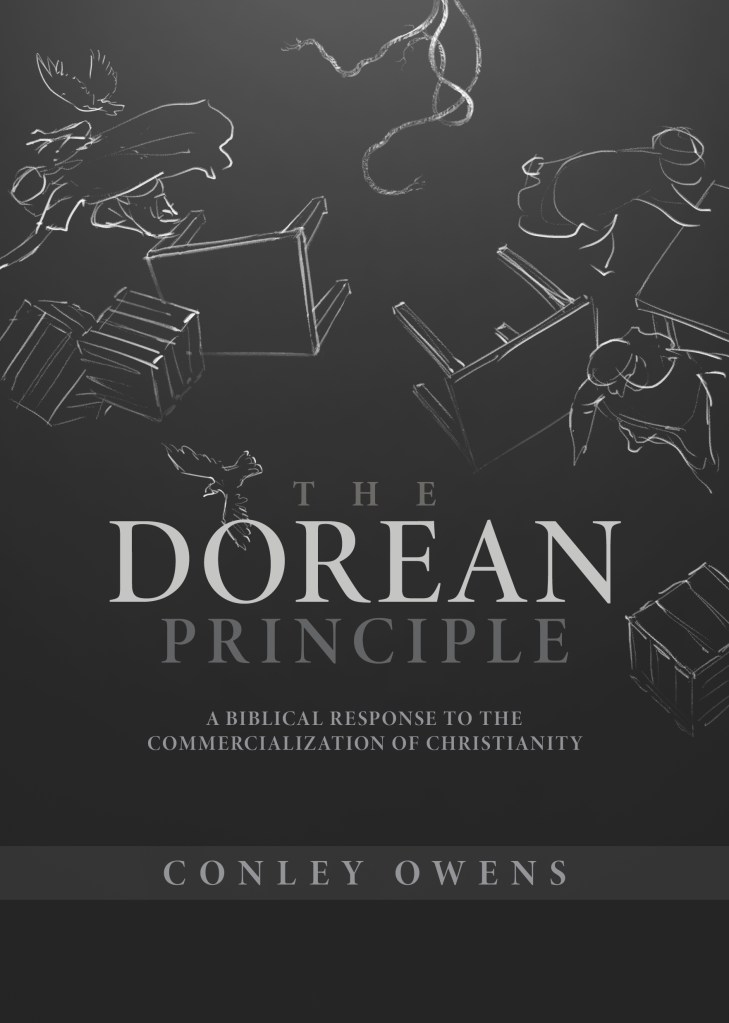
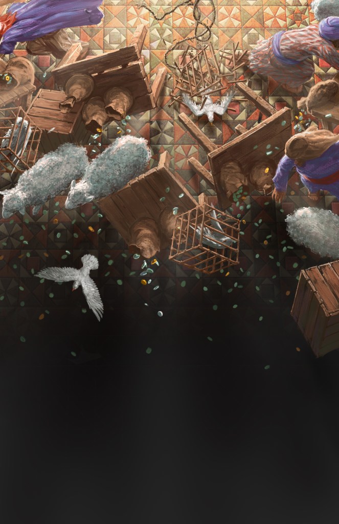
After we reached consensus on this direction, I began to research. You’d be surprised how much research goes into a simple illustration. For instance, I can find a lot of pictures of sheep sideways, straight on, and even from the rear, but I had a hard time finding images of sheep running as seen from above. Ultimately, I found some drone footage of sheep herding to make sure I painted the sheep correctly.
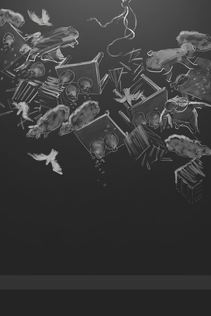
Often historic illustration adds even more complexity to the illustration process. When I looked for a good source for how the temple floor may have looked, I found some exciting news. Recent archaeological findings have pieced together some of the tile floor of Herod’s temple. I studied these sources, but unfortunately they only tell part of the story. We may know how portions of the floor may have looked, but we don’t know where each piece lay in the whole arrangement. I did my research and then sought to make my best guess based on what we currently know.

You will notice that we do not depict Christ on this cover. I’ve gone back and forth about whether it’s bad to image Jesus, since He is the Son of God and we ought not create images of God (Deuteronomy 4:16), or whether it’s ok since he was the Son of man and a historical figure. In past projects I’ve experimented with subtle representation of a figure in somewhat the right period and geographic ethnicity, but in this cover I completely removed any representation, merely showing the whip. We only see the effects of Christ. Also, to emphasize metaphorical meaning, the scene is lit from the top of the illustration as if the light radiates from just above the whip.
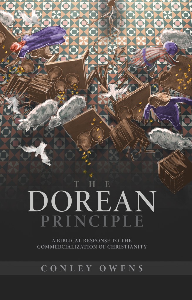
Not all metaphors work, though. At first I made all the money golden, because we often equate the color with money or riches. However, according to my research the temple money exchangers accepted only or mostly silver coinage. To ensure historical accuracy we went with silver instead of gold.
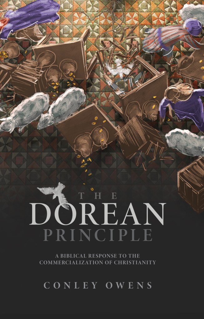
In the end we have a book cover that represents the contents of the book. The audience is already beginning to notice and read it. (It’s available to read for free online!) While the subject matter and aesthetics grabs the readers attention, the title stands out, clearly readable. The result is an arresting but understandable book cover intended to intrigue the audience so they connect with the contents of the book.
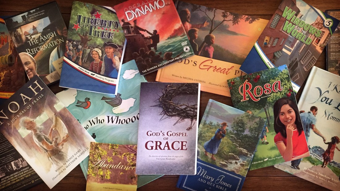
Sprinkled throughout this article are a few other covers that I’ve done for an assortment of different products and needs. Some are recent and some are from way back when. I hope something in here catches your imagination.
Please let me know if you need a cover for your project. I love making covers!
